 Invenia Blog
A Visual Exploration of Coal and Electricity Generation
18 Jul 2018In the US, discussions regarding coal tend to be divisive, and are often driven more by politics than data. In this post, we will take an exploratory dive into detailed public data related to electricity generation from coal, and show how this can be used to better understand these systems and the changes they have been undergoing in recent years.
We will look specifically at aspects related to the life cycle of coal, from its origin in coal mines, to its shipments within and between regions, and on to its final use in coal-fired power plants. We will also focus on coal use for electricity generation, as the US electric power sector is responsible for about 90% of overall consumption of coal.
The data we’re going to look at is published by the U.S. Energy Information Administration and is publicly available. In particular, we focus on several of the bulk data files that were released as part of the EIA Open Data API.
The raw data is available in a JSON format, and is very detailed, with information on shipments from specific coal mines to power plants, and also on the operating statistics of power plants.
Coal Production
Here we use the EIA bulk data on coal which can also be browsed online.
The animation below shows the yearly amount of coal produced, both at the level of individual mines, and also aggregated statistics for total mine production per state. From this, one can see that the mines tend to be locally concentrated based on the various coal basins, and also that the amount of production is by no means evenly distributed.
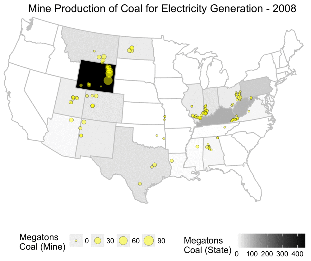 Yearly coal production for electricity usage, shown at both mine and state level.
As someone who grew up in the US, this map challenges the common mythology I often heard about Appalachia and coal mining, and assumptions about states such as West Virginia being dominant producers. While Appalachia was a primary source of coal historically, it has been far eclipsed by Wyoming’s Powder River Basin.
The Powder River Basin is composed of surface mines with giant coal seams as shown below. This region produces around 42% of all coal in the US1, with the North Antelope Rochelle Mine alone providing 12% of total US production in 20162. This single mine produces more coal than West Virginia, the second largest coal mining state.
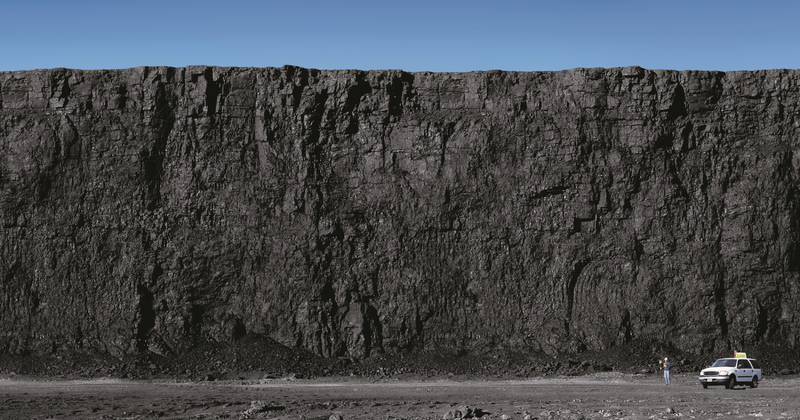 Coal seam, North Antelope Rochelle Mine. By Peabody Energy, Inc. CC BY 3.0, via Wikimedia Commons
The animated map below by the Google Earth Engine Timelapse shows the enormous geographic scale of the Power River Basin mines, along with their historical growth over 32 years of satellite imagery. Over time, one can see new areas being dug out with land restoration efforts following shortly behind.
Coal Mines, Powder River Basin, Wyoming, Google Earth Engine Timelapse
Sulfur Content
The EIA data on coal shipments has incredible resolution, and one can find information about quarterly shipments between individual mines and power plants. For each of these there is information about the type of coal, ash content, heat content, price, quantity, and sulfur content.
The sulfur content of coal is a concern due to SO2 pollution resulting from coal combustion, which can lead to problems such as acid rain, respiratory problems, and atmospheric haze. While high sulfur content does not necessarily translate into high SO2 emissions due to desulfurization technology used by power plants to reduce emissions3, the process of desulfurization is an economic cost rather than a benefit, and examining sulfur content can at a minimum give indications related to the economics of coal prices.
The plot below gives an overview of how the coal produced each year differs in the amount of sulfur content. To construct the plot, we did the following:
- Per year, sort all coal shipments from those with the highest percentage of sulfur to those with the lowest.
- Using this order, calculate the cumulative quantity. The last value is the total amount of coal produced in the US in that year.
A useful feature of this type of plot is that the area under the curve is the total amount of sulfur contained in coal shipments that year. Instead of reducing the yearly amount of sulfur to a single number, this plot shows how it is distributed based on the properties of the coal shipped.
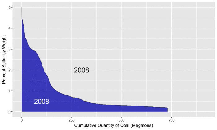 Profile of coal sulfur content.
For reference, we use 2008 (in blue) as a baseline since that is the first year in the EIA data. As the animation progresses, we can see that total coal production peaks in 2010, before steadily decreasing to levels below 2008. By examining the differences between the two curves, we can see where increases and decreases in sulfur from different types of coal have occurred.
For example, on the left side of the plot, the gray areas show increased amounts of sulfur from coal that is high in sulfur. Later in the animation, we see light blue areas, representing decreased amounts of sulfur from low-sulfur coal (and less coal production overall). By subtracting the size of the light blue areas from the gray areas, we can calculate the overall change in sulfur, relative to 2008.
As described further below in this post, electricity generation from coal has decreased, although it has been observed that SO2 emissions have fallen quicker than the decrease in generation, in part due to more stringent desulfurization requirements between 2015 and 2016. The increased production of high-sulfur coal shown in the plot suggests an economic tradeoff, which would be interesting to explore with a more detailed analysis. For example, while low-sulfur coal commands a higher price, one could also choose high-sulfur coal, but then be faced with the costs of operating the required desulfurization technologies.
Transport
After looking at where coal is produced and some of its properties, we will now examine how much is shipped between different regions. To visualize this, we use an animated Chord Diagram, using code adapted from an example showing international migrations.
This technique allows us to visually organize the shipments between diverse regions, with the width of the lines representing the size of the shipments in millions of tons. The axes show the total amount of coal produced and consumed within that year. Arrows looping back to the same region indicate coal produced and consumed in the same region.
To prevent the visualization from being overly cluttered, we group the US states based on US Census Divisions, with the abbreviations for states in each division indicated.
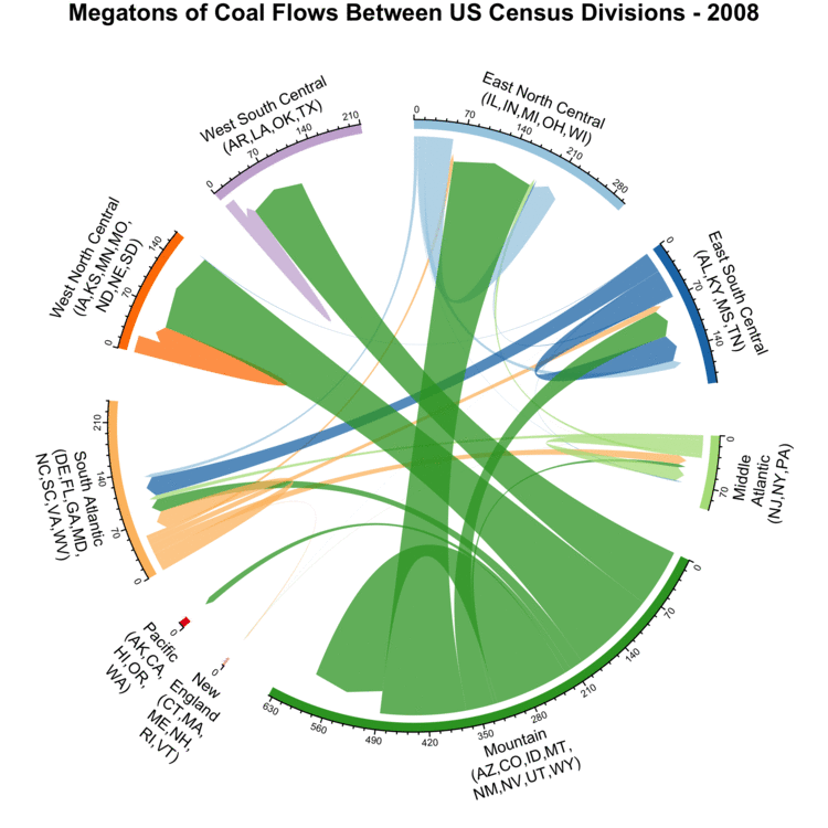 Yearly coal flows between different US Census Divisions.
In the three divisions at the top of the plot (West North Central, West South Central, and East North Central), the majority of coal is sourced from states in the Mountain division. The locations of the top five US coal producing states on the plot are indicated below. This list uses statistics from the EIA for 2016, and includes the total amount of production in megatons, along with their percent contribution to overall US production:
- Wyoming: 297.2 MT (41%) - Mountain (bottom)
- West Virginia: 79.8 MT (11%) - South Atlantic (left)
- Pennsylvania: 45.7 MT (6%) - Middle Atlantic (right, below middle)
- Illinois: 43.4 MT (6%) - East North Central (top right)
- Kentucky: 42.9 MT (6%) - East South Central (right, above middle)
Overall, coal shipments have been steadily decreasing since a peak around 2010. Most of the different regions are not self-sufficient, with shipments between regions being common. Only Mountain is self-sufficient, and it also serves as the dominant supplier in other regions as well. Looking a bit deeper, checking the annual coal production statistics for the Powder River Basin reveals that with between 313 and 495 MT of annual shipments, it’s the single area responsible for the vast majority of coal shipments originating from Mountain.
Coal Consumption
We now look at what happens to the coal once it’s used for electricity generation, and also put this in context of total electricity generation from all fuel sources. For this we use the bulk electricity data, specifically the plant level data which can be browsed online. This data contains monthly information on each power plant, with statistics on the fuel types, amount of electricity generation, and fuel consumed.
While this does not directly document CO2 emissions, we can still estimate them from the available data. We know how much heat is released from burning fossil fuels at the plant on a monthly basis, in millions of BTUs (MMBTU). This information can be multiplied by emissions factors from the US EPA that are estimates of how many kilograms of CO2 are emitted for every MMBTU of combusted fuel. This step tells us how many kilograms of CO2 are emitted on a monthly basis. By dividing this number of the amount of electricity generation, we then get the CO2 emissions intensity in the form of \(\frac{kg\ CO_2}{MWh}\).
In the plot below, we use the same approach as that in the sulfur content plot above:
- Yearly generation is sorted from most CO2 intensive (old coal plants) to the least intensive (renewables).
- Using this sorting, the cumulative total generation is calculated.
- The area under the curve represents the total CO2 emissions for that year.
Here 2001 is used as the reference year. Vertical dashed lines are added to indicate total generation for that year, as nuclear and renewables have zero emissions and their generation contributions would not be visible otherwise on the plot. Also, the y axis is clipped at 1500 kg CO2/MWh to reduce the vertical scale shown. The plants with higher values can be older, less efficient power plants, or plants that have been completely shut down and need to consume extra fuel to bring the equipment back up to operating temperatures.
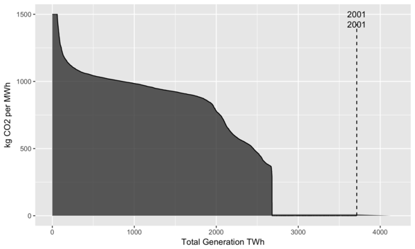 Yearly profiles of US electricity generation by carbon intensity.
From the plot we can see that the amount of generation peaked around 2007 and has been roughly stable since then. While some increases in total emissions occurred after 2001, by looking at 2016, we see that generation from fossil fuels is at the same level as it was in 2001. We can also see two horizontal “shelves”, with the lower one around 400 kg CO2/MWh corresponding to generation from natural gas, and the upper one at 900 kg CO2/MWh corresponding to generation from coal4. In 2016, these shelves are quite visible, and the light gray area represents a large amount of emissions that were reduced by switching from coal to natural gas. Overall it’s clear that the US has been steadily decarbonizing the electricity sector.
Another view is shown in the plot below which examines how much of electricity generation is responsible for how much of total CO2 emissions. The motivation for this is that if you find that 90% of CO2 emissions are from 10% of your electricity generation, then large reductions in CO2 emissions can be achieved by changing only a small fraction of the existing infrastructure. This plot uses a similar approach as the previous ones, with the following steps:
- Sort electricity generation per year, from highest CO2 intensity to lowest.
- Calculate total generation and CO2 emissions per year.
- Calculate cumulative generation and CO2 emissions per year.
- Divide these cumulative totals by the yearly totals to get cumulative percentages.
Starting at 2001, this shows that 27% of electricity generation was from nuclear and renewables, with the remaining 73% from fossil fuels. Over time, more renewables (such as large amounts of installed wind capacity), more efficient power plants, and a switch from coal to natural gas have pushed this curve to the left and steepened the slope. As of 2016, 75% of CO2 emissions come from only 35% of electricity generation, with half of CO2 coming from just 21%.
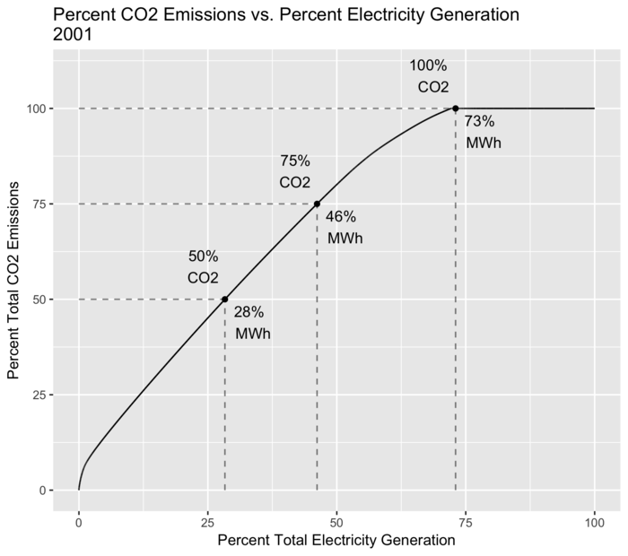 Percent of CO2 emissions coming from percent of electricity generation.
Conclusions
In the above analysis and discussion we looked at only a small subset of what is available in the open data published by the EIA, using a couple of techniques that can help make sense of a deluge of raw data, and tell stories that are not necessarily obvious. Already it is clear that the US is undergoing a large energy transition with a shift towards more natural gas and renewables. As this transition continues to unfold, data such as that published by the EIA will be quite important as we make sense of the resulting environmental and economic impacts.
Footnotes
-
Calculations based on EIA coal production statistics: Powder River Basin vs. Total US ↩
-
Calculations based on EIA coal production statistics: North Antelope Rochelle Mine vs. Total US ↩
-
This could be more systematically investigated by linking the power plant identifiers in the coal shipments with the US EPA’s Emissions & Generation Resource Integrated Database (eGRID) data, which contains information about actual SO2 emissions from power plants. This would allow us to do a sulfur mass balance to determine how much sulfur arrives from coal, how much sulfur in the form of SO2 leaves into the atmosphere, and how much sulfur is removed in the scrubbing process. ↩
-
Higher values for CO2/MWh can be found in literature, especially if life cycle aspects such as emissions from coal mining, transportation, plant operation, etc. are included. The calculations here are only narrowly focused on the combustion of the fuel and the conversion of heat energy into electrical energy. ↩